
Why Blood Pressure is Important
Every minute, someone suffers a stroke caused by undetected high blood pressure. But what if your smartphone could warn you — before it's too late?
Nearly half of adults in the United States (108 million, or 45%) have hypertension (also called high blood pressure (HBP)) (ie, systolic blood pressure ≥ 130 mm Hg).
Blood Pressure is an important indicator for chronic health. Long-term high blood pressure is a major risk factor for stroke, heart disease, heart failure, vision loss, chronic kidney disease, and dementia.
The challenge? Many people don't know they have hypertension.
Regular monitoring often requires a medical device and, in some cases, assistance from others. These requirements, combined with the simple inconvenience of daily testing, create significant barriers to early awareness.
As a passionate builder in the HealthTech space, and as part of my work for the HarvardX Data Science Professional Certificate, I set out to tackle this problem. My goal was to answer a powerful question: Could I build an AI algorithm to instantly estimate a person's blood pressure using only simple, self-reported parameters?
This isn't about replacing medical devices, but about creating an accessible first line of defense. This is the story of that journey, starting with the data and the code.
Blood Pressure Prediction without Medical Device
The Mission: Finding the Clues in the Data
My goal was to predict systolic blood pressure using "handy features" such as age, hours of sleep, and maybe... — the parameters a person readily knows. To do this, I used the National Health and Nutrition Examination Survey (NHANES) dataset, a rich source of public health information.
Let's get started!
1. Understanding the Dataset
My first step was to prepare the raw NHANES dataset for analysis. The initial dataset contained multiple observations for some individuals, so I began by ensuring each person was represented only once. I used R's dplyr package for this and all subsequent data manipulation.
# Load the necessary library
library(dplyr)

# 1. Keep only one record per unique person (ID)
NHANES_clean <- NHANES %>%
  distinct(ID, .keep_all = TRUE)

# 2. Filter for adult females (18-65) with complete data
females_18_65 <- NHANES_clean %>%
  filter(
    Gender == "female",
    between(Age, 18, 65),
    !is.na(BMI),
    !is.na(BPSysAve)
  )

# 3. Filter for adult males (18-65) with complete data
males_18_65 <- NHANES_clean %>%
  filter(
    Gender == "male",
    between(Age, 18, 65),
    !is.na(BMI),
    !is.na(BPSysAve)
  )
After running this preparation script, I had my final, clean datasets ready for exploration. The resulting counts were:
- Unique Individuals: 6,779 records, each with 76 features.
- Female Cohort: 1,886 individuals.
- Male Cohort: 1,908 individuals.
This gave me a solid and reliable foundation for the subsequent analysis.
2. Data Preparation: Taming a Complex Dataset
My analysis began with the rich National Health and Nutrition Examination Survey (NHANES) dataset. The first step was simply to understand the landscape of the data. With 76 different features for each person, the dataset was a complex mix of demographics, lab results, and survey responses.
Here is just a small glimpse() of the variables I had to work with, showcasing the variety of data available:
> # A small sample of the 76 available features in the dataset
> Rows: 6,779
> Columns: 76
> $ ID              <dbl> 51624, 51625, 51630, 51638, 51646, 51647, 51654...
> $ Gender          <chr> "male", "male", "female", "male", "male", "female"...
> $ Age             <dbl> 34, 4, 49, 9, 8, 45, 66, 58, 54, 10, 58, 50, 9, 33...
> $ Race1           <chr> "White", "Other", "White", "White", "White", "White"...
> $ Education       <chr> "High School", NA, "Some College", NA, NA, "College"...
> $ HHIncome        <chr> "25000-34999", "20000-24999", "35000-44999", "75000-...
> $ Weight          <dbl> 87.4, 17.0, 86.7, 29.8, 35.2, 75.7, 68.0, 78.4, 74.7...
> $ Height          <dbl> 164.7, 105.4, 168.4, 133.1, 130.6, 166.7, 169.5, 181...
> $ BMI             <dbl> 32.22, 15.30, 30.57, 16.82, 20.64, 27.24, 23.67, 23...
> $ Pulse           <dbl> 70, NA, 86, 82, 72, 62, 60, 62, 76, 80, 94, 74, 92...
> $ BPSysAve        <dbl> 113, NA, 112, 86, 107, 118, 111, 104, 134, 104, 127...
> $ BPDiaAve        <dbl> 85, NA, 75, 47, 37, 64, 63, 74, 85, 68, 83, 68, 63...
> $ SleepHrsNight   <dbl> 4, NA, 8, NA, NA, 8, 7, 5, 4, NA, 5, 7, NA, 6, 6, 6...
> $ PhysActiveDays  <dbl> NA, NA, NA, NA, NA, 5, 7, 5, 1, NA, 2, 7, NA, NA, NA...
> $ AlcoholDay      <dbl> NA, NA, 2, NA, NA, 3, 1, 2, 6, NA, NA, NA, NA, 3, 6,...
> $ Smoke100        <chr> "Yes", NA, "Yes", NA, NA, "No", "Yes", "No", "No", N...
76 available features in the dataset.
Thank Sharyas3108 for cleaning most of the data. Therefore, I merely performed a few steps further to make the data more suited to my use case.
My data cleaning task was to handle missing values (NA) for key lifestyle features. I made the logical assumption that a person who didn't report physical activity or alcohol consumption had zero of each on that day. I also ensured each person was represented only once, even if they had multiple records.
This was accomplished with the following dplyr code, which also filters for my final target demographic:
# Impute missing values for key features
NHANES$AlcoholDay[is.na(NHANES$AlcoholDay)] <- 0
NHANES$PhysActiveDays[is.na(NHANES$PhysActiveDays)] <- 0

# Keep only one record per unique person (ID)
NHANES_clean <- NHANES %>%
  distinct(ID, .keep_all = TRUE)
3. The First Data Visualization
/Techniques used: Univaritate Statistics/
First Insight: A Concerning Trend in Overall Health
Before diving into blood pressure, I wanted to understand the general health of the population sample by looking at Body Mass Index (BMI).
My BMI? 19.4. :P
Boxplot
Here you are! The Boxplot - provides us with information on the mean/median values of the data.
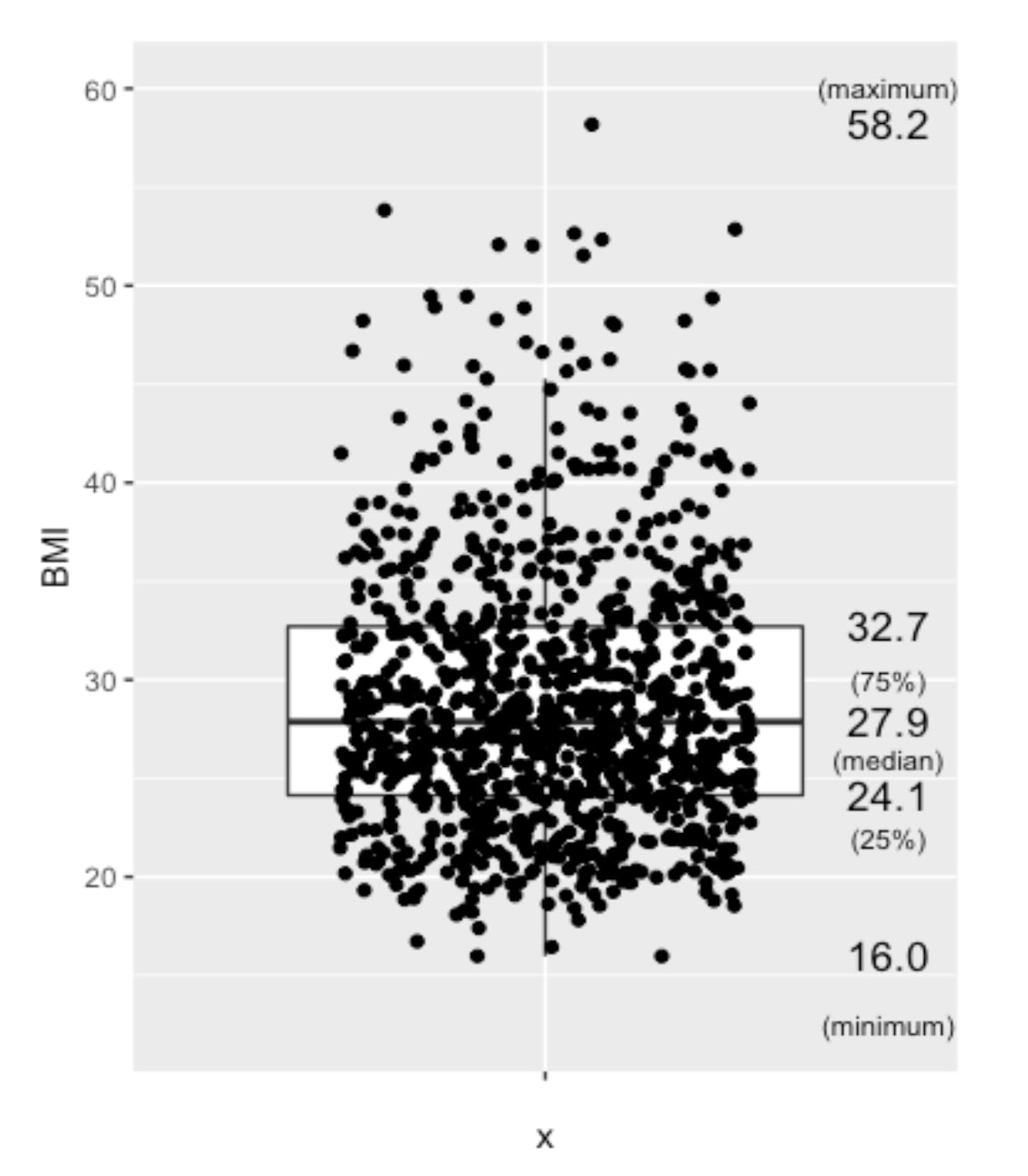
Boxplot of BMI from nHANES, US populations, randomly selected 1000 among approximately 6700 people
Besides, people aged over 65 years old are not considered in this analysis, due to the more complicated medications this group of people may have.
NHANES %>%
  filter(!is.na(BMI), between(Age,18,65), between(BMI, 10,60)) %>%
  head(NHANES, n=1000) %>%
  ggplot(aes(x="", y=BMI)) +
  geom_boxplot(outlier.shape=NA) +
  geom_jitter(width=0.3) +
  stat_summary(geom="text", fun=quantile,
               aes(label=sprintf("%1.1f", ..y..)),
               position=position_nudge(x=0.5), size=4.5) +
  annotate("text", x = c(1.5,1.5,1.5,1.5,1.5), y = c(12.5,22,26,30,60), label = c("(minimum)","(25%)","(median)","(75%)","(maximum)"),size=3)
The Mean BMI for adults (aged 18-65), with the 1000 samples (for a clearer view), mean BMI of 27.9, which is considered overweight, which is quite alarming regarding the health of the population.
Normal BMI ranges between 18.5 and 24.9.
Overweight: BMI between 25 and 29.9.
Obese: BMI of 30 or higher.
The mean BMI of 27.9 implies the target population’s health condition is at a concerning level. This analysis and Blood Pressure Prediction algorithm could act as a useful trigger for people to take care of their Blood Pressure and Chronic Health.
Second Insight: A Crucial Difference Between Genders
Scatter Plot - Blood Pressure vs BMI
Next, I investigated how blood pressure relates to BMI across genders. I suspected a single model for everyone might not be accurate. A scatter plot, a good tool to investigate the relationship between two features, confirmed my hypothesis.
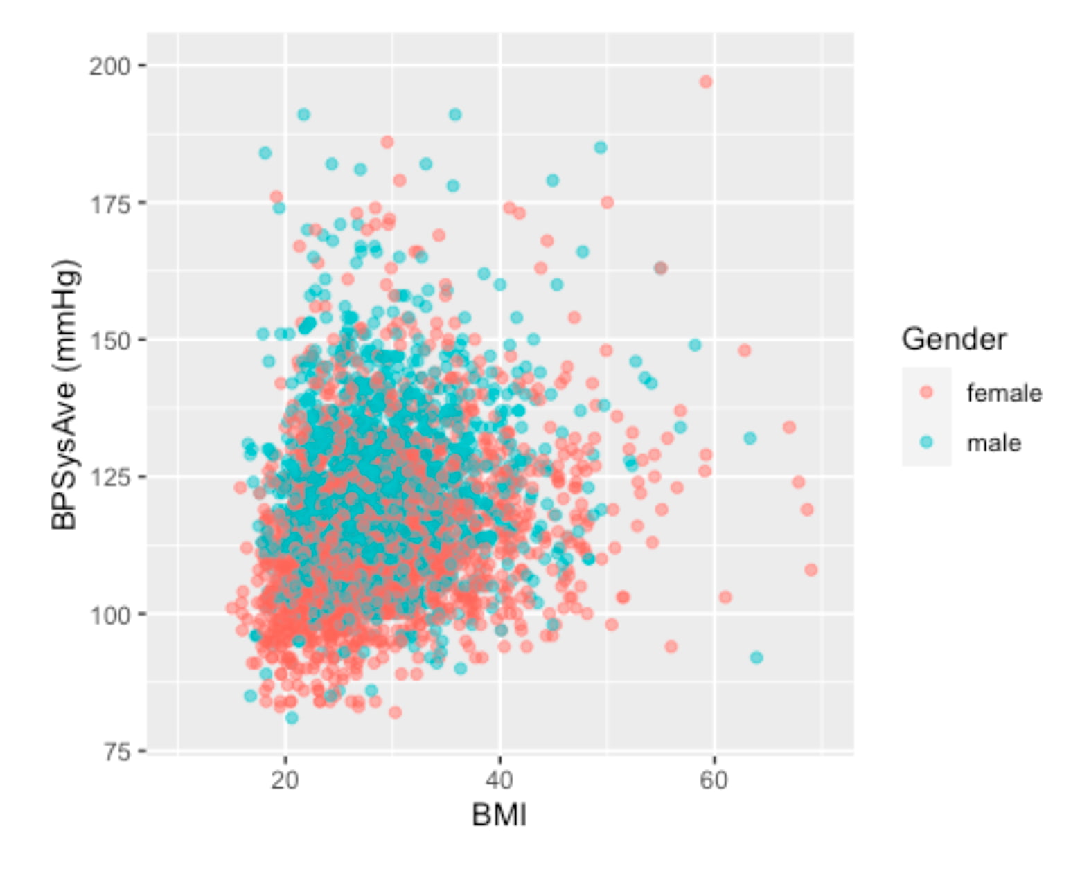
Scatter Plot - Visualizing the relationship between BMI and Blood Pressure. Different colors to identify different genders.
The visualization clearly shows that for the same BMI (imagining a vertical line at any BMI), males tend to have higher systolic blood pressure than females. This discovery was pivotal. To build a more precise and focused model, I decided to narrow the scope of this project to the female cohort aged 30 to 65.
We separated the analysis by gender and chose the Female group in this project.
4. Confidence Interval (CI)
We want to confirm if the dataset contains the true mean of the population by checking the confidence interval (90%, 95%).
Let’s look into the healthy group of people, and compare their Blood Pressure with the literature.
Here, we assume a healthy individual to be:
- non-smoker,
- without a history of diabetes,
- no hard drugs,
- no sleeping trouble,
- with a "general health" that is not considered poor, and
- with a BMI between 18.5 and 25.
As mentioned, the female group is chosen, as we have found that female and male blood pressure seem to behave differently even under the same BMI.
Healthfemale3065_NHANES <- NHANES %>%
  filter(!is.na(Smoke100n), !is.na(BMI_WHO), !is.na(HardDrugs), !is.na(HealthGen), !is.na(SleepTrouble)) %>%
  filter(!is.na(BPSysAve), between(Age,30,65), Gender == "female") %>%
  filter(Smoke100n == "Non-Smoker", Diabetes == "No", HardDrugs == "No", HealthGen != "Poor", SleepTrouble == "No", BMI_WHO == "18.5_to_24.9")
To investigate the CI, we verify if the data is normally distributed. A histogram would be very useful in doing this job.
Healthfemale3065_NHANES %>%
  ggplot(aes(x=BPSysAve)) +
  geom_histogram(bins = 25) +
  geom_vline(aes(xintercept = mean(x=BPSysAve)), col = "red", lwd = 2) +
  geom_text(aes(x=mean(x=BPSysAve), y=13, label=round(mean(BPSysAve),digits=0)),hjust=-0.5, size=6) +
  ylim(0,15)
Okay! I put a red line this time. We don't have to "imagine" :P
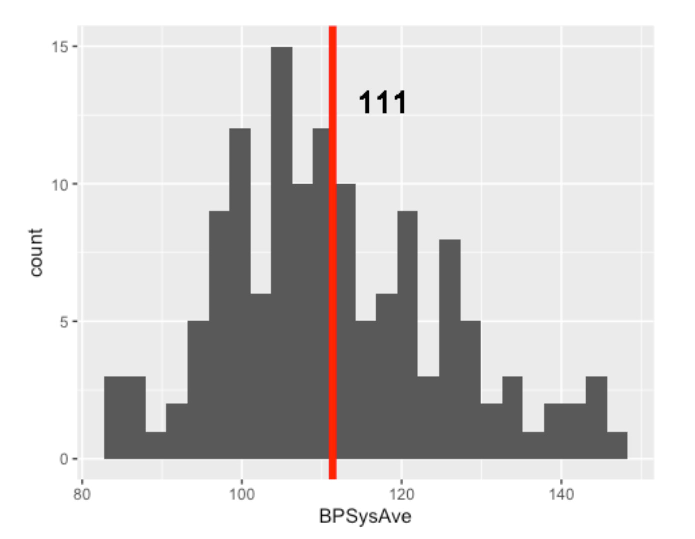
The number of HEALTHY females aged 30 to 65 is only 138
In addition, it is quite obvious that the data is not normally distributed. Long tail is quite common for health data.
5. Validation: Is My Healthy Sample Reliable?
Before building a predictive model, I needed to perform some crucial validation steps:
Does my dataset accurately reflect real-world health norms?
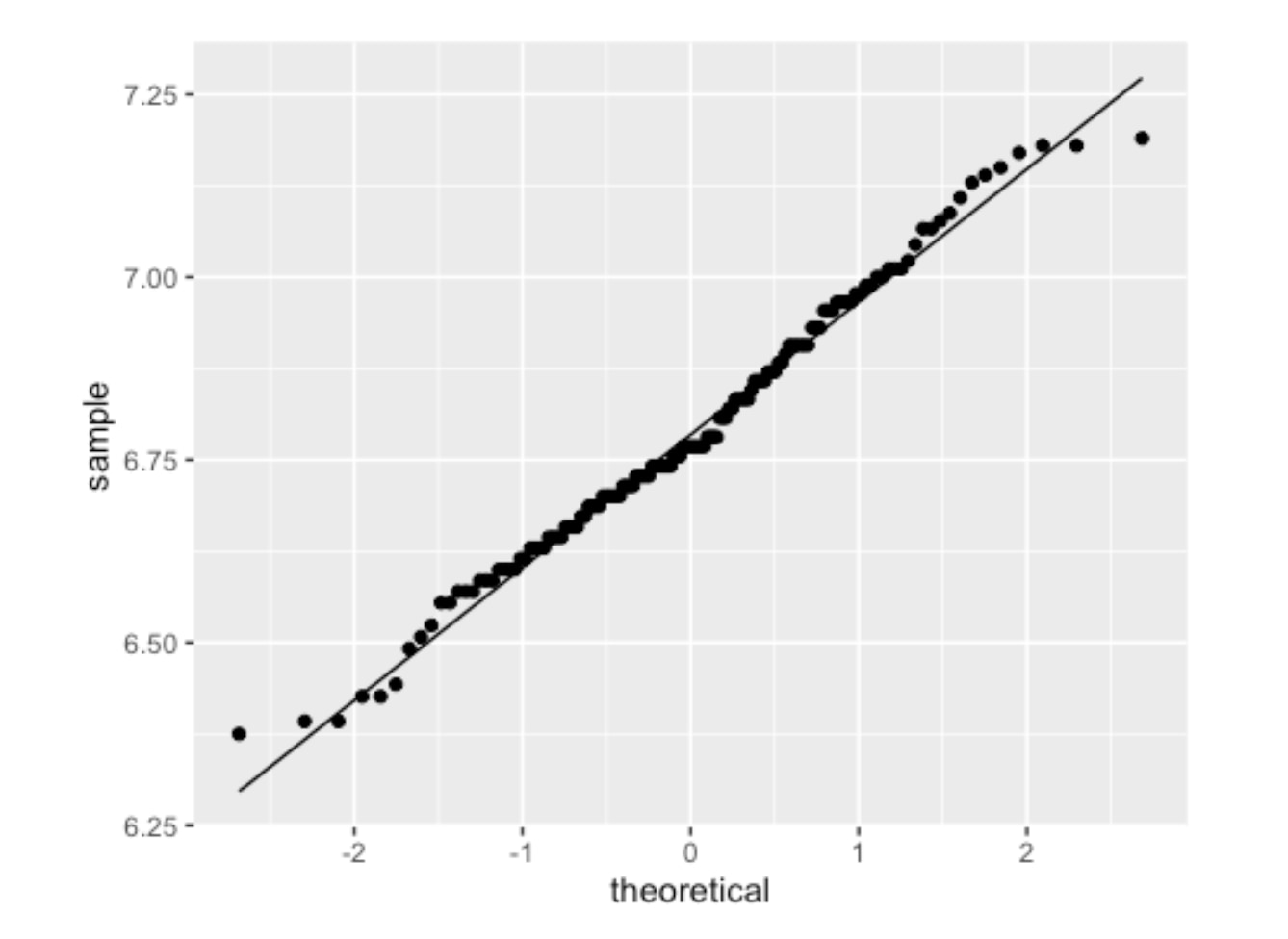
Let’s also see the QQ Plot.
To ensure my dataset was a valid representation of the real world, I compared it to established medical norms.
Healthfemale3065_NHANES %>%
  ggplot(aes(sample=BPSysAve))+
  geom_qq()+
  geom_qq_line()
I created a "healthy" reference group from my data and found that its blood pressure distribution was not perfectly normal.
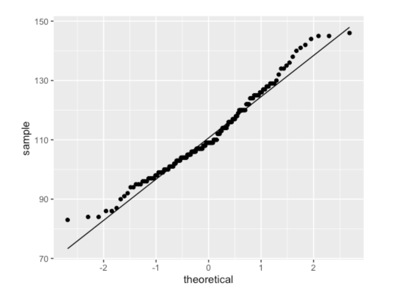
QQPlot of Healthy Female (18-65) Blood Pressure
The two ends of the above graph do not align well. Then I deployed a standard statistical technique -- applying a log2 transformation.
Healthfemale3065_NHANES %>%
  ggplot(aes(sample=BPSysAve %>% log2))+
  geom_qq()+
  geom_qq_line()
The resulting QQ plot showed a much better fit as follows.
QQPlot of Healthy Female (18-65) Blood Pressure with log2 transformation
The log2 systolic blood pressure for healthy subjects is approximately normally distributed. With this normalized data, I calculated the 90% confidence interval for systolic blood pressure in my healthy sample.
90% or 95% confidence interval for the HEALTHY group
Using this mean and standard error (SE), I calculated the 90% confidence interval. The general formula for a confidence interval is mean ± (critical_value * standard_error).
> # A tibble: 1 x 4
> mean sd n se
> <dbl> <dbl> <int> <dbl>
> 1 6.79 0.181 138 0.0154

> Mean value (log2): 6.788
> Geometric mean value (log2): 110.50132885906
> Standard deviation (log2): 0.180701073811383
90% Confidence Interval = sample statistic mean +/- stardard error
> 95% Confidence Interval (in log2 scale): [6.43;7.15]
> 95% Confidence Interval (mmHg in original scale): [86.02;142]
90% Confidence Interval = sample statistic mean +/- stardard error
> 90% Confidence Interval (in log2 scale): [6.61;6.97]
> 90% Confidence Interval (mmHg in original scale): [97.49;125.2]
After calculating the interval on the log2 scale, I converted it back to the original mmHg scale. The final result was clear and decisive:
The 90% Confidence Interval for Systolic Blood Pressure in my healthy sample was [97.49, 125.2] mmHg.
This result was a major success for the project. Medical literature widely considers a systolic blood pressure up to 125 mmHg to be the upper limit of normal for a healthy adult in this age range. The fact that my data-derived interval aligned perfectly with this benchmark gave me high confidence that the NHANES dataset was a reliable and accurate foundation for building a predictive model. With this validation complete, I could proceed to the modeling stage.
Let’s continue the analysis!
6. Predictive Model for Specific Age and Gender Groups
With my dataset validated, my next step was to confirm that building a predictive model for specific age and gender groups was the right approach. It's well-known that blood pressure changes with age and differs between sexes, but I wanted to prove this with the data itself.
I started by visualizing the distribution of systolic blood pressure across different segments of the population.
First, I looked at the overall adult population (18-65), which had a mean blood pressure of 118 mmHg.
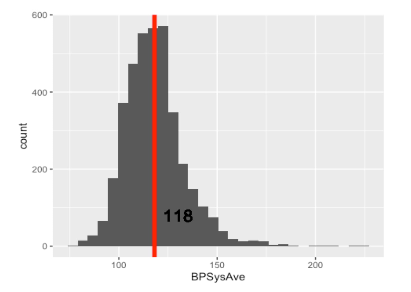
Distribution and Mean of Blood Pressure of All Gender Adults (Remarks: Including Healthy and Unhealthy)
But is this average representative of everyone? I hypothesized that younger adults would have lower blood pressure. I created two more histograms to compare the 18-29 age group against the 30-65 age group.
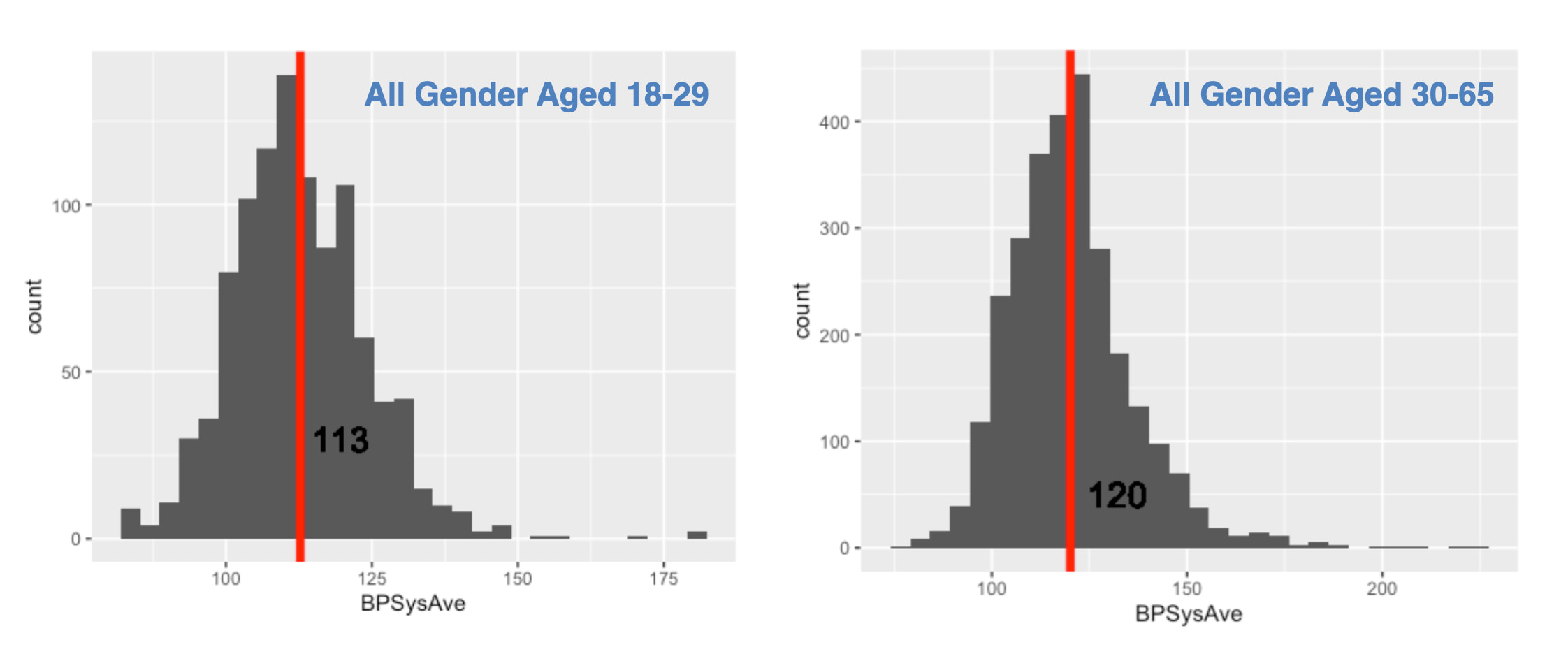
Histograms of Blood Pressure by Age Group :
The data supported my hypothesis. The mean blood pressure for younger adults was 113 mmHg, while for the older group, it was 120 mmHg.
Next, I drilled down into the 30-65 age group to see if gender made a difference.
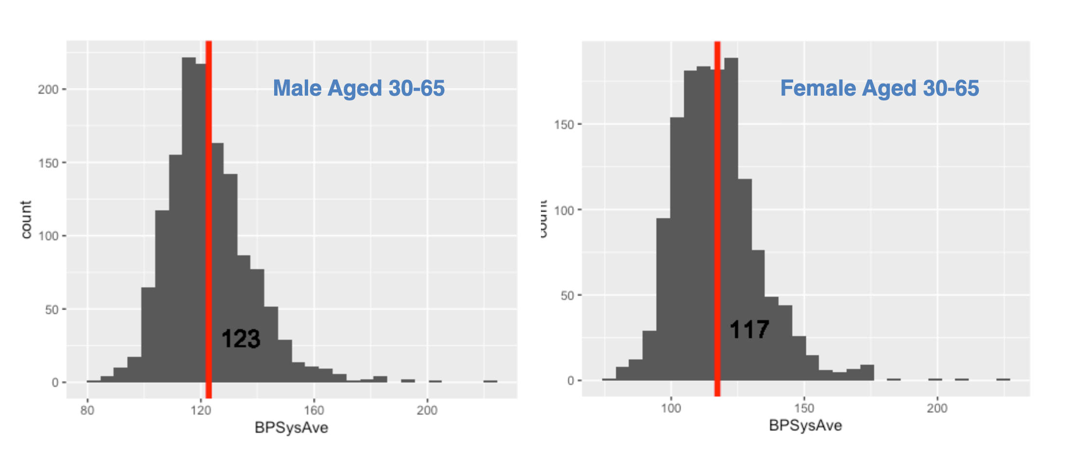
The difference was again clear and significant. Males in this age bracket had a mean blood pressure of 123 mmHg, whereas females had a mean of 117 mmHg.
The Conclusion from the Data
This exploratory analysis led to an undeniable conclusion, summarized in the table below:
| Group (Aged 30-65) | Mean Systolic BP |
| :----------------- | :--------------: |
| Male               |     123 mmHg     |
| Female             |     117 mmHg     |
Given these clear, data-driven differences, it was obvious that a single "one-size-fits-all" model would be inaccurate. To build a precise and useful tool, it was essential to analyze blood pressure by distinct gender and age groups. This is why I proceeded to build my predictive models focusing specifically on the female 30-65 cohort.
For readers interested in the specific code used to generate these visualizations or the calculations for the confidence intervals mentioned in my previous validation step, you are welcome to explore the complete R Markdown file on my GitHub repository - AmiceLab.
Sum Up Part 1 & What will be in Part 2
Again, we aim to predict Blood Pressure by using the HANDY features of a person. "Handy Features" are defined as simple, self-known parameters—such as age, weight, and sleep habits—that allow a person to estimate their blood pressure on the spot, providing an instant snapshot of their current health.
In the next episode, we continue our analysis and predictive model development, focusing on females aged 30 to 65. And see what Handy features can be used to predict blood pressure. From the literature of human physiology, possible features that affect a person's blood pressure would be: “Age”, “Weight”, “Height”, “BMI”, “SleepHrsNight”, “PhysActiveDays”, “AlcoholDay”. Let’s see how they are related to one another and the blood pressure. The following are charts we will work out in part 2. See you next Article!
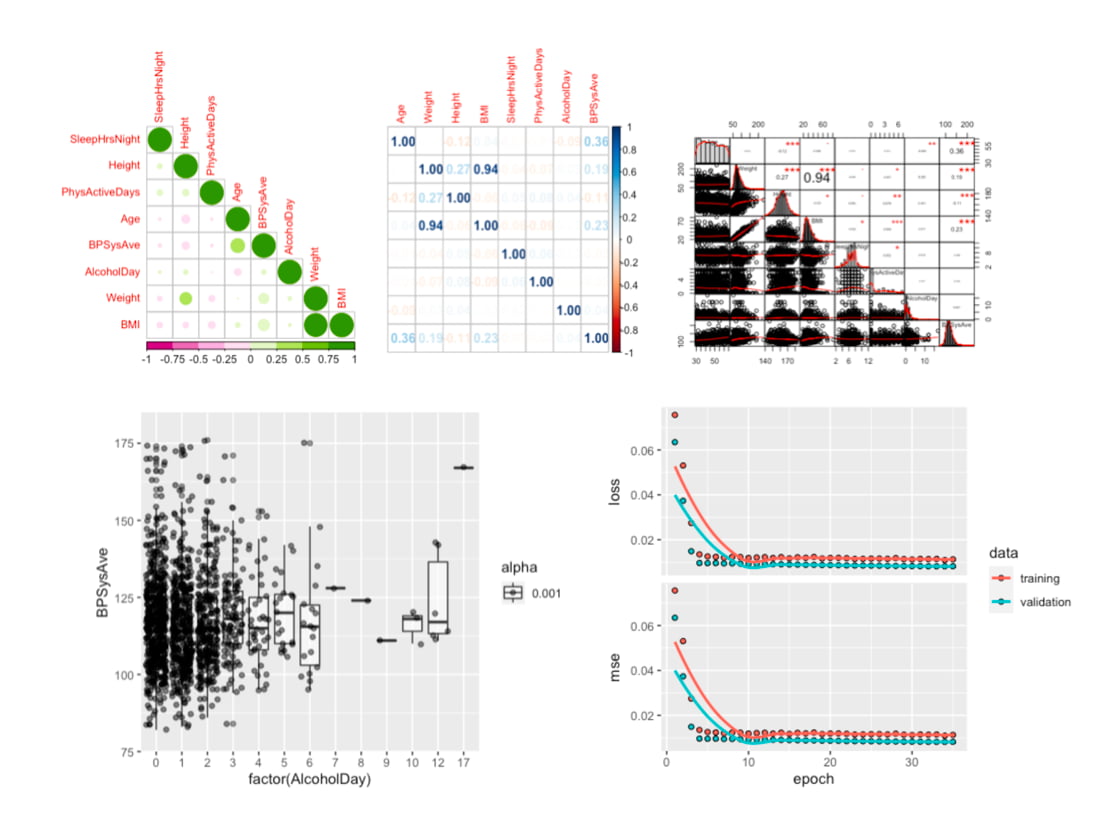
The data analysis we will go through in Part 2.
#MachineLearning #DigitalHealth #AIinHealthcare #BloodPressure #HealthTech